Powered by Blogger.
Showing posts with label Neptune. Show all posts

Interior Paint Shades - Soft Neutrals part 1

Thursday, October 24, 2013

Soft, neutral paint shades create a calm environment for all areas of the home. Contemporary tones inspired by nature are offset against natural textures and pure white. A tranquil palette of mist, fog, putty, taupe, grey and pebble. Here are a few of my favourite decorating ideas and suggested paints to try.
Above image: Woon Magazine photography by Jonah Samyn - soft grey palette with white and black accents for this gorgeous contemporary dining room - suggested paint: 'Mist'by Neptune a soft blue grey 
Above image: French Connection Homeware - driftwood side tables, pure white sofa and palest grey soft furnishings - suggested wall paint: 'French Grey pale' 161 a soft neutral grey from the Little Greene Paint Company
Above image: contemporary living room with pale modern chaise sofa, blonde wood coffee table and neutral styling - Karin Meyn for Piet Boon via her Pinterest boards - suggested wall paint colour:'Blackened' 2011 a cool very pale grey by Farrow and Ball 
Above images: I created the paint swatches by eye using the manufacturers colour cards - for accurate samples please contact the paint companies for colour cards and test pots
Above images: 1.Homeware by French Connection - copper side table and contemporary sofa range in conjunction with DFS  2.Above image: detail of stylish linen cushions from the contemporary holiday home in the dunes by Interior design company Remy Meijers from the Netherlands 3.Enamel steel side table from French Connection Homeware 4.large grey glass vase from Conran at Marks and Spencer 5.antique metal table lamp from French Connection Homeware 
Above images: 1.Natural styling and textures of coral, stone and wood Karin Meyn for Piet Boon via her Pinterest boards 2.misty woodland image from the gorgeous Italian contemporary bathroom collection from Neutra Design 3.Chalk white bowl from the interior shop Ebury Home and Garden 4.grey glass 'Cased' votive from French Connection Homeware Paints: 5.'Lily' a soft palest neutral beige that changes in different lights by Neptune 6. 'Blackened' 2011 a cool very pale grey by Farrow and Ball 7. 'Salt' a warm white without any yellow by Neptune 8.'China Clay Dark' 178 a soft deep mauve taupe (great feature wall shade) by Little Greene Paint Company 
Above image: ??? Does anyone know who this kitchen is by please? Soft taupe grey walls, white woodwork and contemporary pale oak kitchen with granite top - suggested wall paint: 'Lamp Room Gray' 88 a warm mid grey from Farrow and Ball
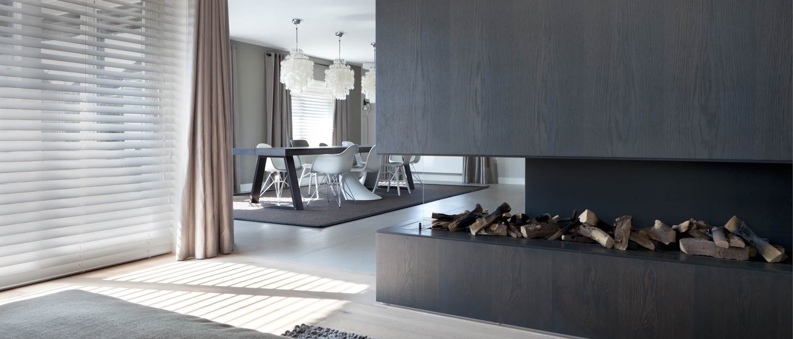
Above image: soft grey and taupe contemporary dining room by Interior design company Remy Meijers from the Netherlands, with a mixture of iconic chairs such as the Panton by Verner Panton (1959/19600) from Vitra and the Plastic side chairs by Charles and Ray Eames (1950) from Vitra The mother of pearl chandelier pendants I believe are the 'Fun' 1DM by Verpan - suggested wall paint to achieve this look: 'China Clay dark' 178 a rich deep taupe with a plum overtone by the Little Greene Paint Company
Above images: I created the paint swatches by eye using the manufacturers colour cards - for accurate samples please contact the paint companies for colour cards and test pots
Above images: 1.stunning shades of taupe and grey - contemporary kitchen by Belgian interior design Bieke Vanhoutte 2.foggy lakeside image from the gorgeous Italian contemporary bathroom collection from Neutra Design 3.pale grey colour scheme against handmade blonde oak Amish chopping boards from Canvas 4.handmade dark grey mug from Ebury Home and Garden 5.deep taupe walls against white woodwork and pale blonde floorboards scheme by contemporary Belgian interior design company Bieke Vanhoutte Paint shades: 6.'Seneca Rock' a warm deep taupe with plum tones by Kelly Hoppen 7.'Asian Spirit' a cool grey taupe from Kelly Hoppen 8.'Pavilion Grey'242 a warm Swedish grey from Farrow and Ball 9.'Dove Tale' 267 a warm mauve toned grey from Farrow and Ball 
Above image: contemporary holiday home in the dunes by Interior design company Remy Meijers from the Netherlands, with a mixture of iconic chairs such as the Panton by Verner Panton (1959/19600) from Vitra and the Plastic side chairs by Charles and Ray Eames (1950) from Vitra Stunning modern fireplace - suggested wall paint to achieve this look: 'Baked Clay' a neutral rich grey by Kelly Hoppen

More in this interior paint series to follow....!

For more information on anything shown in the above images please click on the names under each photograph to go through to their web sites. I create my mood boards/colour palettes with a computer programme called Photoshop by Adobe which is available for both Apple Mac and PC computers.

As always, if I have featured your photograph and you would rather I didn't, please do not hesitate to contact me and I will remove it with my sincerest apologies. 

With warmest wishes
 

Spring Clean for Easter!

Thursday, March 7, 2013

A crisp, sunny start to March signals the arrival of Spring so time to clear away those Winter warmers and freshen up for Easter! A clean colour palette of gentle chalk tones add a light touch to the home. A tender colour palette of Duck Egg Blue, Leaf, Zinc, Hen's egg, Twig and Blossom refresh and renew.
Above image: Cox and Cox Spring 2013 home collection  
Above images:1.A zinc grey wood burning stove in The Beach Studios and Locations 2.A retro child's ride on car from Blog Deas Og Mia - her beautiful home 3. colour palette The Paper Mulberry (the colour palettes I put together are my suggestions for the general room schemes and don't particularly refer to paint unless specifically stated)4.Neptune home and accessories for Spring Summer 2013 
Above image: A vintage antique trunk with 'chippy' paint in plum/brown tones beautifully with the pale grey sofa and white walls of the gorgeous home of Blog Deas og Mia
Above image: fresh white tulips in the gorgeous home of Blog Deas 
go Mia
Above image:Pretty twig and egg wreath from the lovely blog Sa Vitt Jag Vet
Above images:1.Unique homewares and interiors from Rowan and Wren 2.Colour palette suggestion - The Paper Mulberry(the colour palettes I put together are my suggestions for the general room schemes and don't particularly refer to paint unless specifically stated) 3.Egg basket from Garden Trading 4.Linen Ticking striped cushions from Loop the Loop
Above image: Metal desk lamp Cox and Cox Spring 2013 home collection  
Above image: A retro wall clock from Cox and Cox Spring 2013 home collection and metal filing shelf looks fresh against the tongue and grove panelled wall
Above images:1.Speckled terracotta egg collection from Terrain 2.White heart dish perfect for holding Easter Eggs from The White Company 3.Colour palette suggestion - The Paper Mulberry(the colour palettes I put together are my suggestions for the general room schemes and don't particularly refer to paint unless specifically stated) 4.Gorgeous Easter table setting by Nina Holst of the wonderful blog Stylizimo 5.Sweet tablescape for Spring from the home of Les Tissus Colbert on Flickr 
Above image:Pussy Willow stems displayed on an antique wood console table - film and photographic location 'Annabels House' SW18 on 1st Location
Above image:Contemporary Spring interior at film and photographic location 'Elmboune Road' SW17 - Light Locations
Above image:Ladder shelving Cox and Cox Spring 2013 home collection 
Above images:1.Gorgeous Easter table setting by Nina Holst of the wonderful blog Stylizimo 2.Colour palette suggestion - The Paper Mulberry (the colour palettes I put together are my suggestions for the general room schemes and don't particularly refer to paint unless specifically stated)3.Pretty painted Easter egg decorations from the lovely blog Sa Vitt Jag Vet 4.Vintage painted trunk and lantern in the gorgeous home of Blog Deas og Mia 5.Pussy Willow basket created by Scottish artist Lizzie Farey 
Above image:Gorgeously fresh Easter table setting by Nina Holst of the wonderful blog Stylizimo

Favourite Easter Pinterest boards: 
- 'Easter' by Marja van der Neut


For more information on anything shown in the above images please click on the names under each photograph to go through to their respective web sites. I create my mood boards/colour palettes with a computer programme called Photoshop by Adobe which is available for both Apple Mac and PC computers.

The colour swatches shown above I create as a suggestion for furnishings, carpets, ornaments, fixtures, fittings and paints. They do not come from manufacturers charts but I am sure that if you want to use them for paint shades that your favourite supplier will be happy to help match them. 

As always, if I have featured your photograph and you would rather I didn't, please do not hesitate to contact me and I will remove it with my sincerest apologies. 

With warmest wishes
 

Contemporary Country Colours

Thursday, July 26, 2012


Fresh, clean earth tints form a soothing colour palette for today's country living. Shades of Clay, Slate, French grey, Shutter Blue, Mulberry, Damson, Willow leaf and Gooseberry green set against chalky white add a contemporary twist to traditional country styling. Modern material such a stainless steel and aluminium contrast against the natural elements of pale stone and bleached wood. Here are a few of my most recent finds starting with the heart of the country home - the kitchen.  
Above image: detail of Sims Hilditch interior design for Neptune - gorgeous bespoke kitchens and new home accessories range
Above image: a divine new kitchen design from Sims Hilditch interior design for Neptune

Above images: gorgeous new table linen china and cutlery from the Neptune range
Above images: 1. gorgeous new candle range from Neptune 2.table linen china and cutlery from the new Neptune range 3. paint shade in "Lily" by Neptune 4 from the new lighting range by Neptune
Above image: pretty contemporary coloured enamel kitchen ware from Garden Trading 
Above image: bespoke kitchens and fabulous furniture range from Neptune
Above image: 1.gorgeous pale chalky kitchen by Plain English 2. & 4.table linen and china from the new Neptune accessories range 3.beautiful handcrafted kitchens and furniture from Neptune Colour watches: The Paper Mulberry colour suggestions
Above image: handmade kitchens by Chalon in gorgeous pale chalky shades with slate grey accents try Farrow and Ball "French Grey" number 18 for a similar colour to the door and skirting board

Above image: divine oak framed homes by Border Oak with interior design and styling by Merry Albright The Paper Mulberry note: try "Card Room Green" number 79 from Farrow & Ball for a similar shade to the kitchen island - we have used it on our back door and windows
Above image: planter pots on tray in "Shutter Blue" by Garden Trading
Above image: bespoke kitchens and fabulous furniture range from Neptune
Above image: the gorgeous kitchen and dining room of interior stylist and photographer Helena Bernald of the wonderful blog The Swenglish Home
Above images: 1.lovely new lighting range from Garden Trading in fabulous colours such a "Shutter blue", "Clay" and "Slate" 2.metal trough planter by Garden Trading 3.a set of numbered, French styled, ceramic mixing bowls by Garden Trading Colour swatches: The Paper Mulberry colour suggestions 
Above image: gorgeous contemporary farmhouse in Oxfordshire location for photography and film by locations agency Light locations
Above image: divine bespoke kitchen furniture and china range from Neptune
Above image: the "Chichester" kitchen from Neptune 
Above image: classic jug in "Gooseberry" by Garden Trading


For more information on anything shown in the above images please click on the names under each photograph to go through to their web sites. The colour swatches featured are my suggestions for accent shades and do not relate to specific paints unless otherwise stated, but I'm sure your favourite paint companies would be happy to suggest matches! 

With warmest wishes